
ElevatedButton은 Flutter의 Material Design 버튼 중 하나로, 사용자에게 클릭 가능한 버튼을 제공합니다. 기본적으로 입체적인 외형을 가지고 있으며, 다양한 스타일을 설정할 수 있는 기능을 제공합니다. 아래에서는 ElevatedButton의 사용 방법과 다양한 스타일링 옵션에 대해 예제와 함께 설명하겠습니다.
1. 기본 사용 방법
ElevatedButton을 사용하는 기본적인 방법은 매우 간단합니다. onPressed 콜백과 child 속성을 사용하여 버튼이 눌렸을 때의 동작과 버튼에 표시될 위젯을 지정할 수 있습니다.
import 'package:flutter/material.dart';

void main() {
  runApp(MyApp());
}

class MyApp extends StatelessWidget {
  @override
  Widget build(BuildContext context) {
    return MaterialApp(
      home: Scaffold(
        appBar: AppBar(
          title: Text('ElevatedButton Example'),
        ),
        body: Center(
          child: ElevatedButton(
            onPressed: () {
              print('Button Pressed');
            },
            child: Text('Press Me'),
          ),
        ),
      ),
    );
  }
}
2. 속성 및 스타일링
ElevatedButton은 다양한 속성을 통해 버튼의 스타일을 커스터마이즈할 수 있습니다. 주요 속성과 그 사용 예제를 살펴보겠습니다.
1. 버튼 크기 조정
style 속성의 ElevatedButton.styleFrom 메서드를 사용하여 버튼의 크기를 설정할 수 있습니다.
ElevatedButton(
  onPressed: () {
    print('Button Pressed');
  },
  child: Text('Large Button'),
  style: ElevatedButton.styleFrom(
    padding: EdgeInsets.symmetric(horizontal: 40.0, vertical: 20.0), // 패딩 설정
    textStyle: TextStyle(fontSize: 20), // 텍스트 크기 설정
  ),
),
2. 버튼 색상 변경
버튼의 배경색과 텍스트 색상을 변경할 수 있습니다.
ElevatedButton(
  onPressed: () {
    print('Button Pressed');
  },
  child: Text('Colored Button'),
  style: ElevatedButton.styleFrom(
    backgroundColor: Colors.green,
    foregroundColor: Colors.white,
  ),
),
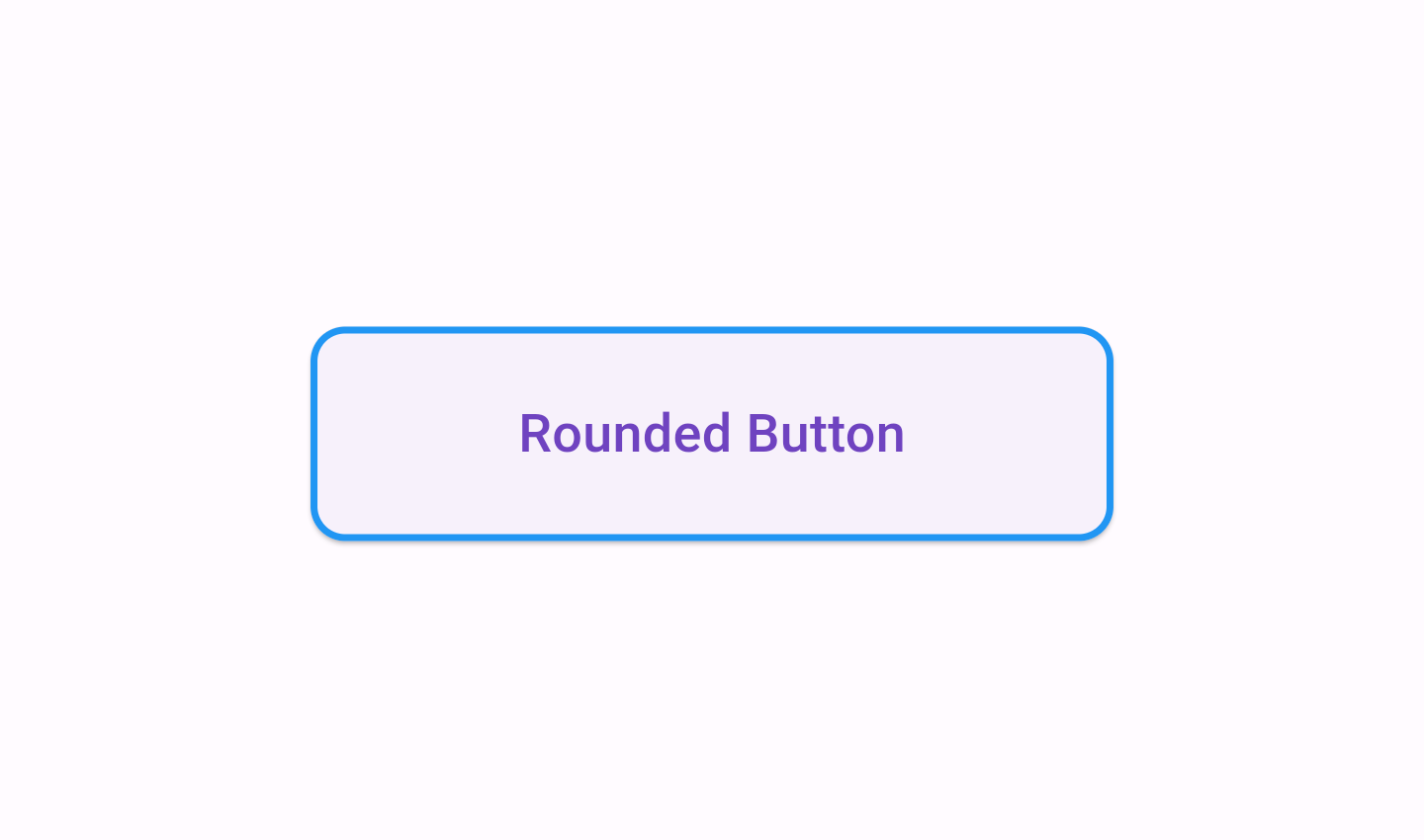
3. 버튼 모양 변경
버튼의 모양을 둥글게 하거나, 테두리를 추가할 수 있습니다.
ElevatedButton(
  onPressed: () {
    print('Button Pressed');
  },
  child: Text('Rounded Button'),
  style: ElevatedButton.styleFrom(
    padding:
        EdgeInsets.symmetric(horizontal: 60.0, vertical: 20.0),
    shape: RoundedRectangleBorder(
        borderRadius: BorderRadius.circular(10.0),
        side: BorderSide(color: Colors.blue, width: 2.0))
  ),
),
4. 버튼에 아이콘 추가
아이콘을 추가하여 더 풍부한 버튼을 만들 수 있습니다. 이를 위해 ElevatedButton.icon 생성자를 사용할 수 있습니다.
ElevatedButton.icon(
  onPressed: () {
    print('Button with Icon Pressed');
  },
  icon: Icon(Icons.thumb_up), // 아이콘 설정
  label: Text('Like'), // 텍스트 설정
  style: ElevatedButton.styleFrom(
    primary: Colors.blue, // 배경 색상
    onPrimary: Colors.white, // 텍스트 색상
  ),
),
5. 비활성화 상태
onPressed 콜백에 null을 할당하면 버튼이 비활성화 상태가 됩니다.
ElevatedButton(
  onPressed: null, // 비활성화 상태
  child: Text('Disabled Button'),
  style: ElevatedButton.styleFrom(
    primary: Colors.grey, // 비활성화 시의 배경 색상
    onPrimary: Colors.black, // 비활성화 시의 텍스트 색상
  ),
),
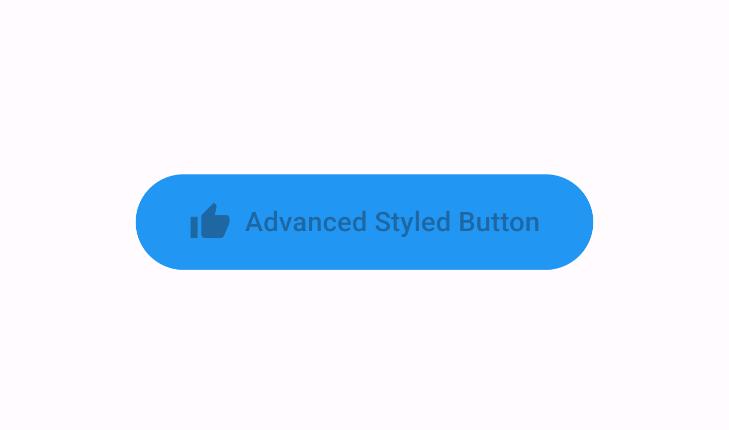
3. 고급 스타일링
Flutter 2.0 이상에서는 ButtonStyle을 사용하여 더 복잡한 스타일링이 가능합니다. ButtonStyle은 ElevatedButton의 다양한 상태에 따라 스타일을 정의할 수 있습니다.
ElevatedButton(
  onPressed: () {
    print('Advanced Styled Button Pressed');
  },
  child: Text('Styled Button'),
  style: ButtonStyle(
    backgroundColor: MaterialStateProperty.all(Colors.blue), // 기본 배경 색상
    padding: MaterialStateProperty.all(EdgeInsets.symmetric(horizontal: 30.0, vertical: 15.0)), // 기본 패딩
    textStyle: MaterialStateProperty.all(TextStyle(fontSize: 18)), // 기본 텍스트 스타일
    shape: MaterialStateProperty.all(RoundedRectangleBorder(
      borderRadius: BorderRadius.circular(15.0),
    )),
    overlayColor: MaterialStateProperty.resolveWith<Color>((states) {
      if (states.contains(MaterialState.pressed)) {
        return Colors.blueAccent; // 눌렸을 때의 배경 색상
      }
      return null; // 기본 배경 색상 유지
    }),
  ),
),
4. 요약
onPressed: 버튼이 눌렸을 때의 동작을 정의.child: 버튼에 표시될 위젯(주로Text).style:ElevatedButton.styleFrom또는ButtonStyle을 사용하여 버튼의 스타일을 설정.ElevatedButton.icon: 아이콘과 텍스트가 있는 버튼 생성.
ElevatedButton은 매우 유연한 위젯으로, 다양한 상황에 맞게 스타일링하여 사용할 수 있습니다. 이를 통해 Flutter 앱에서 사용자가 상호작용할 수 있는 다양한 버튼을 만들 수 있습니다.
'언어 > Flutter' 카테고리의 다른 글
| [ Flutter ] Layout에서 수직 중앙 정렬 하기 (0) | 2024.06.21 |
|---|---|
| [ Flutter ] Layout에서 수평 중앙 정렬 하기 (0) | 2024.06.21 |
| [ Flutter ] Android APK 빌드하기 (0) | 2024.06.21 |
| [ Flutter ] 버튼 사용하기 (0) | 2024.06.20 |
| [ Flutter ] Icon 사용하기 (0) | 2024.06.20 |


